Instagram launched its “Rosalía” font five weeks ago, based on the pop star’s handwriting. The reaction, however, was swift and divided. Some saw it as playful, expressive, and refreshingly personal. For others, every time it was used, it would make them cringe.
I was also in the cringe camp.
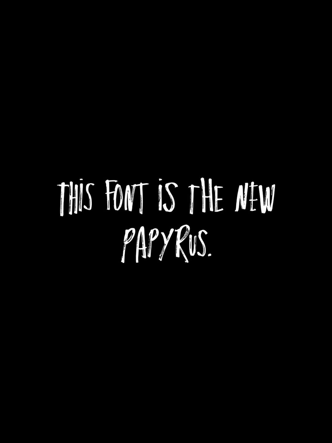
Not because the font itself is necessarily bad, but because of how it was used. Constantly, in paragraphs, illegibly, and, honestly, too loosely. Just scroll through the comments on this Instagram post, which says, “This font is the new Papyrus,” and you’ll find no shortage of hot takes. “Renting a billboard in my small town with only this on it,” one user quipped. Another joked, “It’s the Live Laugh Love mom font.”