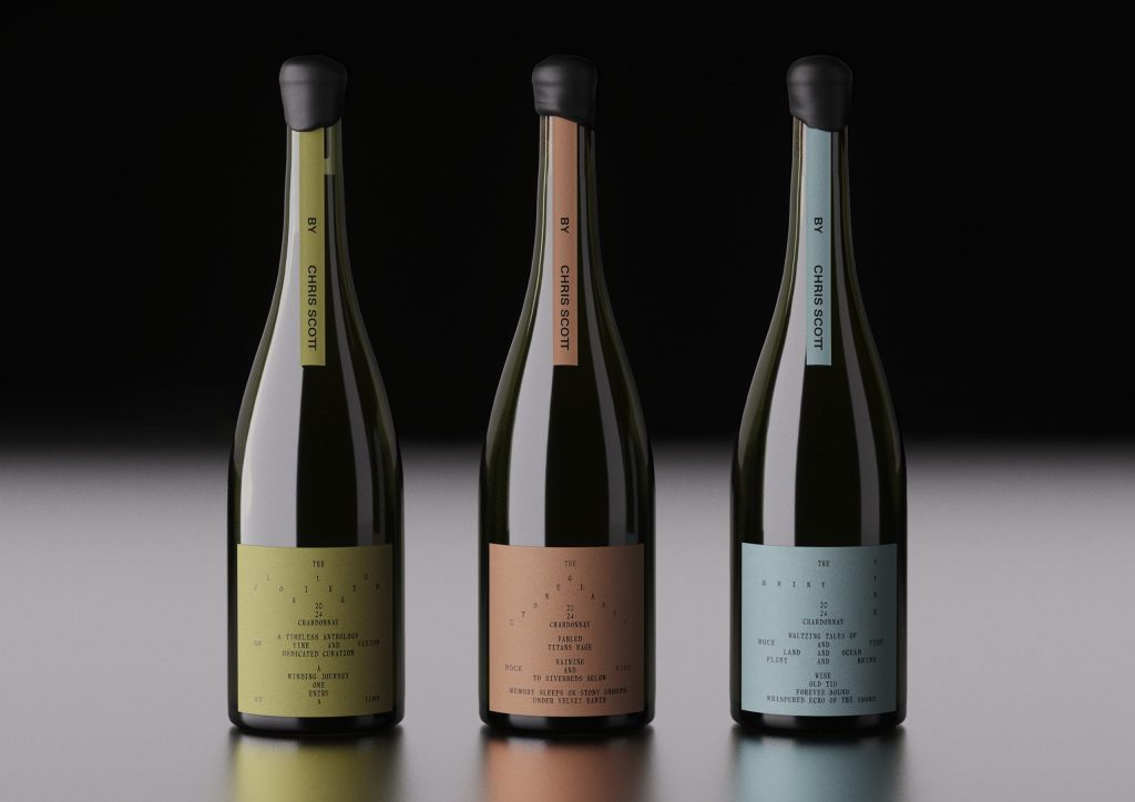
Chris Scott Wines, designed by Seachange, is minimalistic, yes, but it’s also confident. Each bottle features a single, structured label with light typography. The text is carefully spaced, creating rhythm and pause, mirroring the deliberate craft behind the wine itself. Muted earth tones, including sage, clay, and sea blue, hint at the landscapes that inspire each varietal. The simplicity lets negative space do the talking.