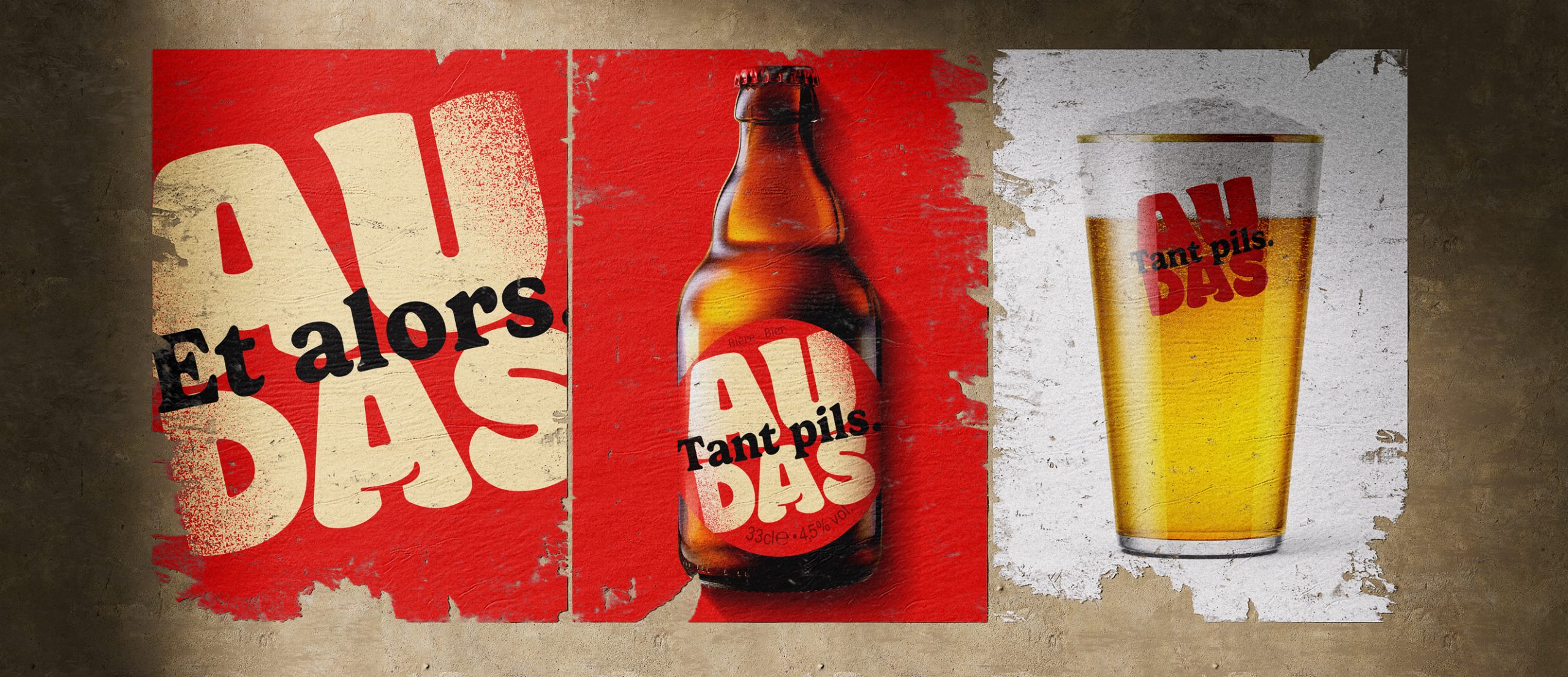
Audas packaging, designed by Quatre Mains, leans into oversized typography that utilizes chunky letterforms stretching across a bright red label. The type’s slightly distressed texture gives the artwork a lived-in edge without drifting into false nostalgia.
The layout feels quick and conversational, with the amber glass serving as a warm backdrop. It’s a straightforward design with big type, a tight color palette, minimal extras, but the use of just the right amount of quirkiness makes this a beer that’s the opposite of pretentious and just the right amount of fun.