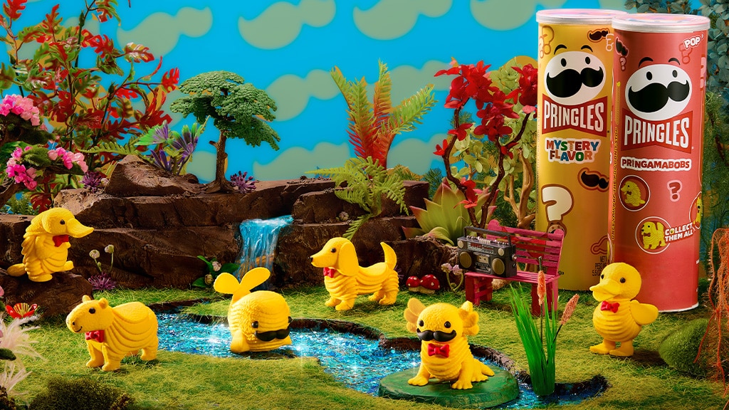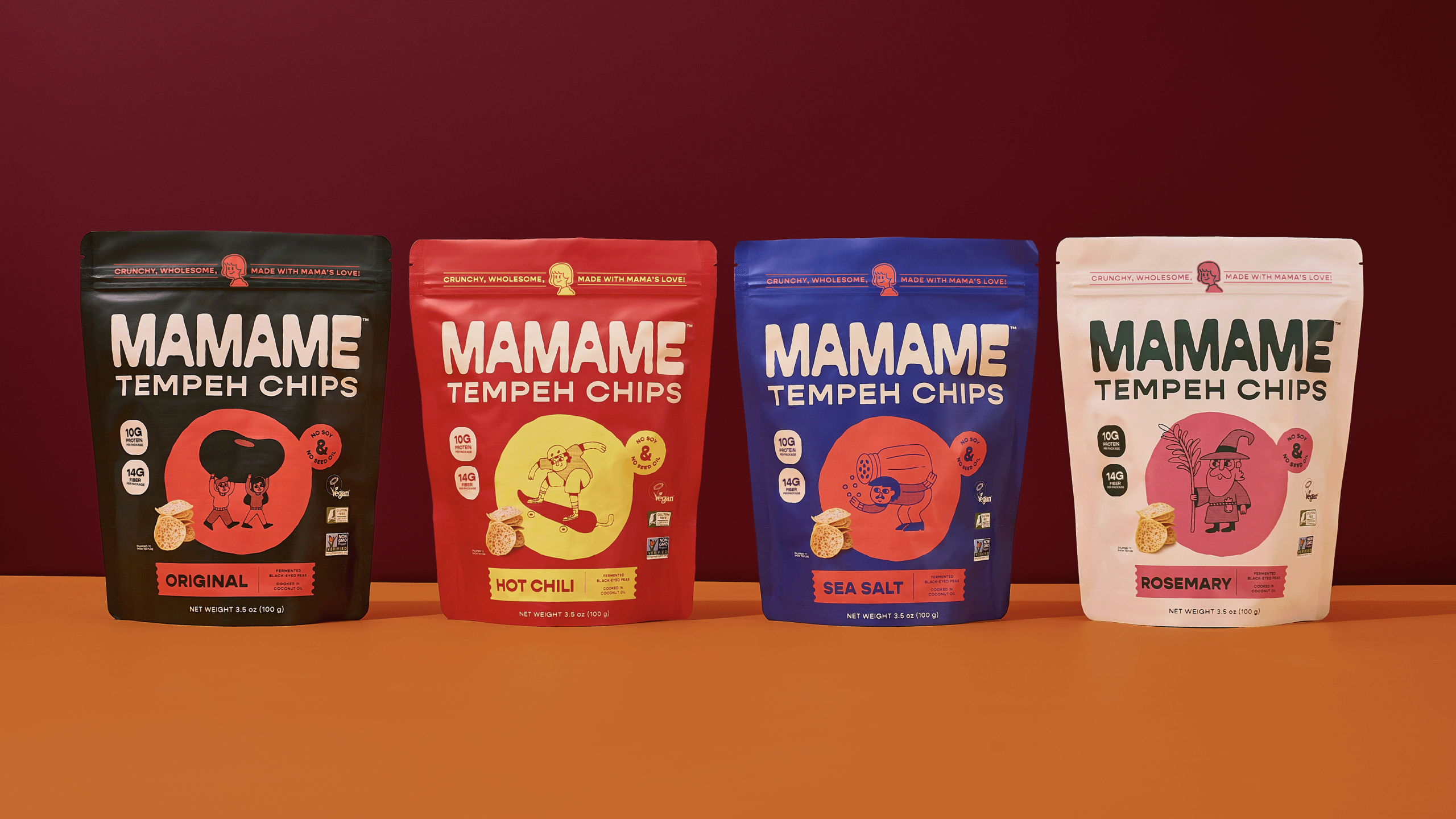
Mamame’s packaging, designed by Steven Roberts, focuses fully on character-driven storytelling, using chunky, hand-drawn illustrations that match each flavor’s energy. The typography is thick, blocky, and slightly uneven, giving the bags an approachable, almost hand-stamped quality.
The palette shifts dramatically per flavor, but the structure stays tight, making the line easy to spot and even easier to remember. There’s a childlike joy to the design, but it’s not enough to keep this packaging system from feeling fully trustworthy and authentic.