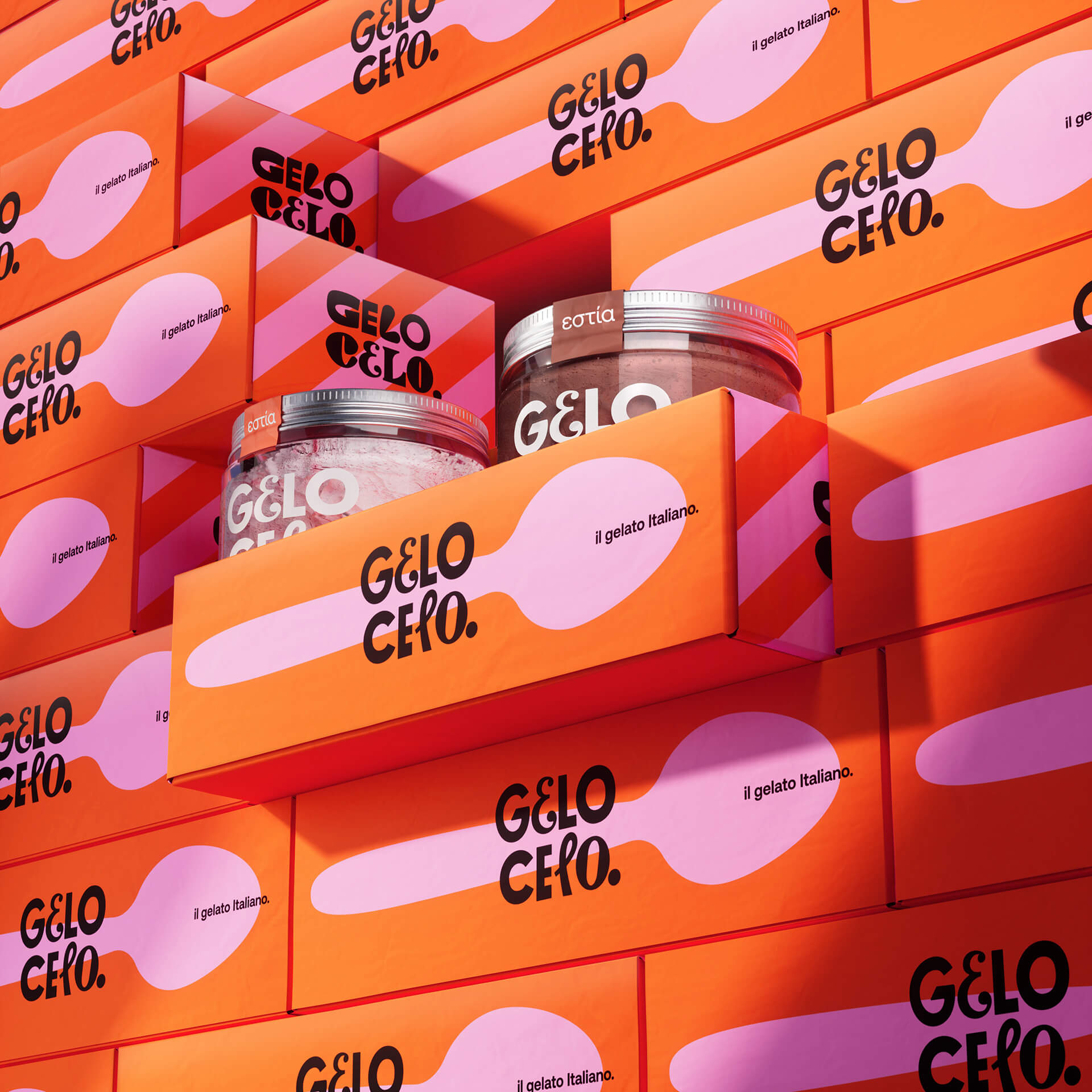
Gelo Celo’s packaging, designed by Boo Republic! , turns gelato into a full-blown sensory experience before you open the lid. The identity is all about playful contrast with bright pinks, loud oranges, and creamy purples stacked against clean geometric layouts.
The typography is punchy and rounded, sitting snugly inside blobs and circles that mimic melting scoops. Every box, cup, and cone feels like it’s part of a cohesive visual rhythm that makes grabbing a pint feel even more of an indulgence than it already is. Here for it.