Showcasing paper and what it’s capable of seems like an Office-esque task. Normies might not think twice about it. So long as the copier is full, what’s the point?
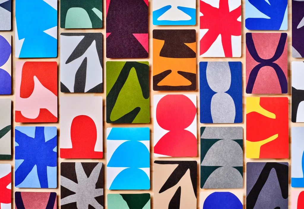
Best not to speak of such things in front of Hybrid Design and Mohawk Paper. For over a decade, the design studio and maker of fine papers have shown designers paper’s potential not only through Mohawk Quarterly, but also through special promotional releases. Miraculously, they somehow never have that icky veneer of promotion; they even feel collectible. In the case of Mohawk Mosaic, a winner at DIELINE Awards 2025, the studio highlights a new range of Mohawk goods that feature fresh, bold colors and distinctive textures. With Mosaic, in particular, Hybrid designed packaging that elegantly displays sample cards featuring the paper’s qualities, along with expressive shapes that encourage mixing and matching.

Or, in other words, play.
We spoke with Hybrid Design’s founder and executive creative director, Dora Drimalas, about how the award-winning project came together.

Obviously, Hybrid has had a hand in producing Maker Quarterly and other promotional projects for Mohawk. How far back does the relationship go, and why have they always turned to Hybrid to bring these undertakings to life?
Our relationship with Mohawk goes back about 13 years. It actually started with a simple request to design a traditional print promotion—but instead of following the brief exactly, we proposed something different, which became the Mohawk Maker Quarterly. What was meant to be a one-off piece evolved into a long-running, collectible series that’s become part of the brand’s DNA.
What makes the partnership work so well is that we’re both Mohawk’s audience and their creative partner. We love the same things they do—craft, storytelling, and the beauty of print—so we’re able to act as true brand advocates. There’s a shared respect for design and a sense of creative trust that’s been there from the very beginning.

What was the brief behind the Mosaic Paper promo?
Mosaic was a new collection of printing and packaging papers engineered specifically for folding and scoring, so our goal was to showcase that capability through the promo itself. We approached it from a packaging perspective—designing a piece that feels like an elevated unboxing experience. The format allowed us to explore new dimensional elements, like the exposed shoulder, that brought a tactile sophistication we hadn’t incorporated in previous Mohawk projects.

What inspired you to use the expressive shapes on the cards to celebrate how color and texture work in tandem?
We were thinking about literal mosaics and the idea that they are all combinations of similar elements that become something new. The unbound format also lets you have a more tactile experience with the paper. You’re forced to hold it in your hand. You can combine papers with loose cards or see how they look on a table or with other materials. That was an opportunity to add a little serendipity and fun to the experience—being able to combine and recombine the shapes into different mosaics. It adds levity to the experience and, in the end, is closer to how the paper will live out in the world.

Tell me more about the outer box holding the cards. How did you land on that particular structure?
We knew we wanted to work with loose cards, so we explored different ways to house them that felt significant and permanent. Permanence is something we think about all the time with printed objects. It’s something lacking in so much of what we engage with. It also carries a message: This thing is important, it matters, you should pay attention.


What stands out the most about your partnership with Mohawk is that it feels like a love letter to the tools of the trade and to print as a whole. I’m not one to believe that print will ever die. But what is it about the experience of working on projects like this that sits so comfortably in the studio’s wheelhouse?
That’s such a nice way to put it—and it’s true. It really does feel like a love letter. We’ve always believed that print isn’t just a medium, it’s an experience. There’s something about the physicality of paper—the texture, the weight, the craft—that connects directly to emotion and memory.
Working with Mohawk sits naturally in our wheelhouse because it combines everything we care about: storytelling, design as craft, and the intersection of beauty and utility. Every project is both creative and tactile—it asks us to think conceptually and feel materially at the same time. For a studio like ours, that’s the sweet spot.


Are there any other special details about the Mosaic promo that you want to draw attention to that might not have received their proper due?
Another thing we highlight is how powerful color is in conveying personality, which is a more human way of saying differentiation. The paper colors in Mosaic are really fresh, and we wanted to show how they are a jumping-off point for personality. We wanted to show how they came to life with even simple color combinations. It’s part of the reason we made four colorways.

I understand the studio has a book coming out soon. How does Mohawk fit into the grand scheme of it?
Mohawk is a huge part of our book, Hybrid: Curiosity In All Things—they’ve been with us for more than half the studio’s existence. Our relationship has really shaped who we are as a team. Over the years, our work has evolved together, with each project building on the last, deepening the dialogue between design, craft, and storytelling. Including them in the book felt natural—they’re not just a client, they’re part of our story.