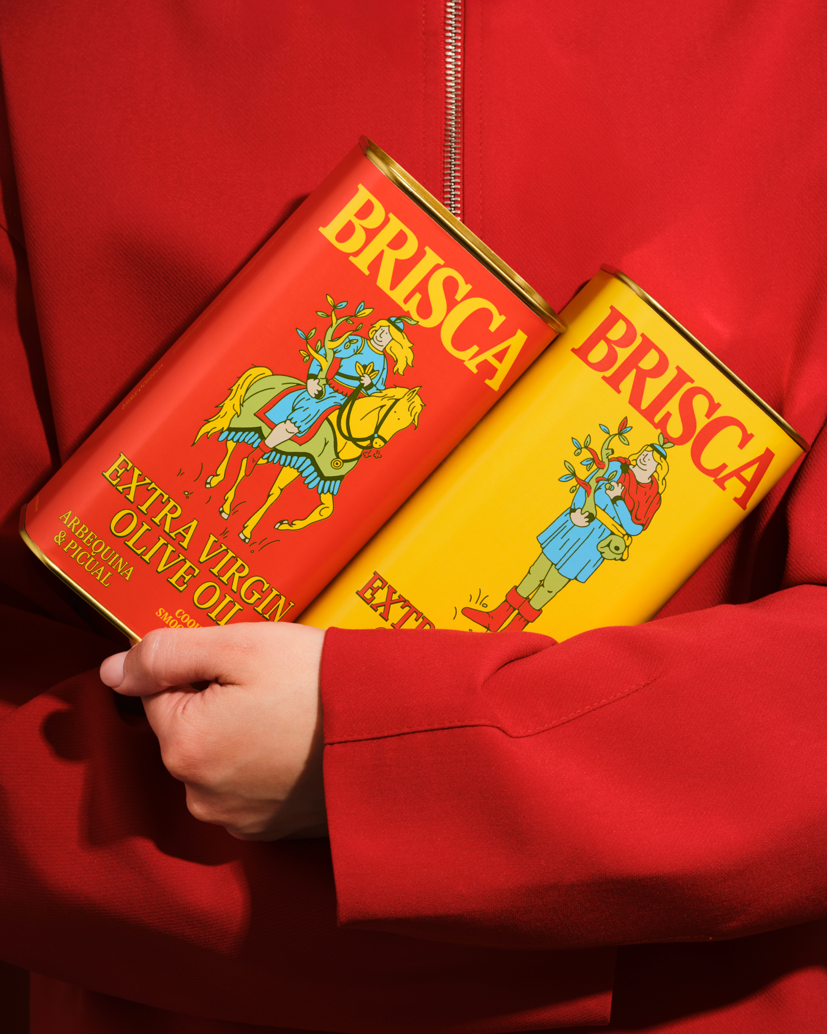
Onmi Design gives Brisca olive oil packaging a sense of theater through simplicity and character. The tin cans are drenched in saturated red and yellow, featuring only a serif logotype and playful illustrated figures that look pulled from a deck of vintage playing cards. The characters lend movement and storytelling without clutter. Gold tops add a quiet shine that contrasts the matte body, while the layout keeps hierarchy clear, this is a brand that cares about storytelling through design.
Rafael Martinez, co-founder Onmi Design, shares more insight into the design process below.
