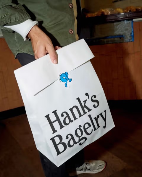
Hank’s Bagelry got a fresh identity from Studio Ongarato that’s both playful and practical. The design leans into simplicity with clean typography, crisp layouts, and a charming blue mascot.
The running bagel character adds motion and humor, appearing on bags, cups, and boxes as if he’s sprinting your order straight to you. Plus, the repetition of the mascot pattern makes the humble takeout box feel like part of the brand experience. I am a big fan of brands that can give way to a playful attitude on their packaging.