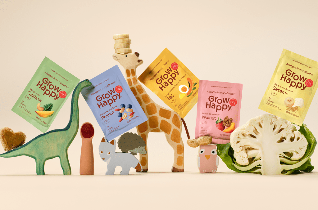
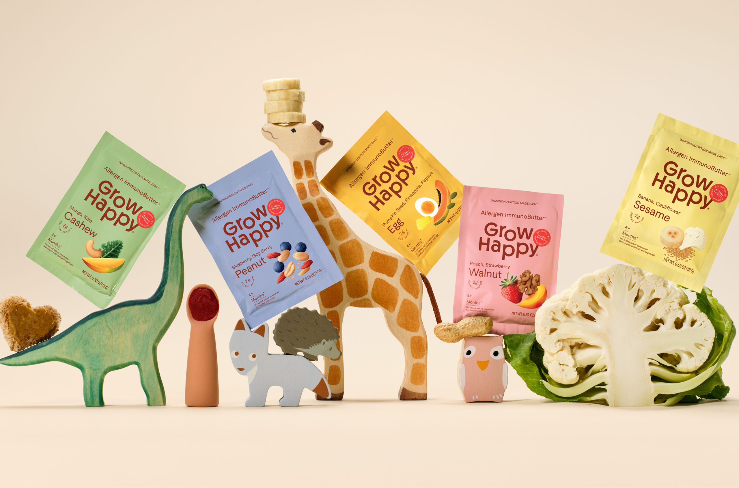
GrowHappy’s packaging, designed by Wedge, takes something that could’ve felt clinical and turns it into something bright, warm, and full of joy. Early-allergen introduction is a category that easily leans sterile and serious, but this brand feels like a breath of fresh air. The design speaks directly to parents who want to feel confident about what they’re feeding their kids, while keeping things light and approachable.
Front and center is the bold, rounded GrowHappy logo. Its soft curves and generous spacing give off a sense of calm and care; it feels nurturing, not corporate. The rest of the type keeps that same energy, as it’s clear, simple, and easy to read.
