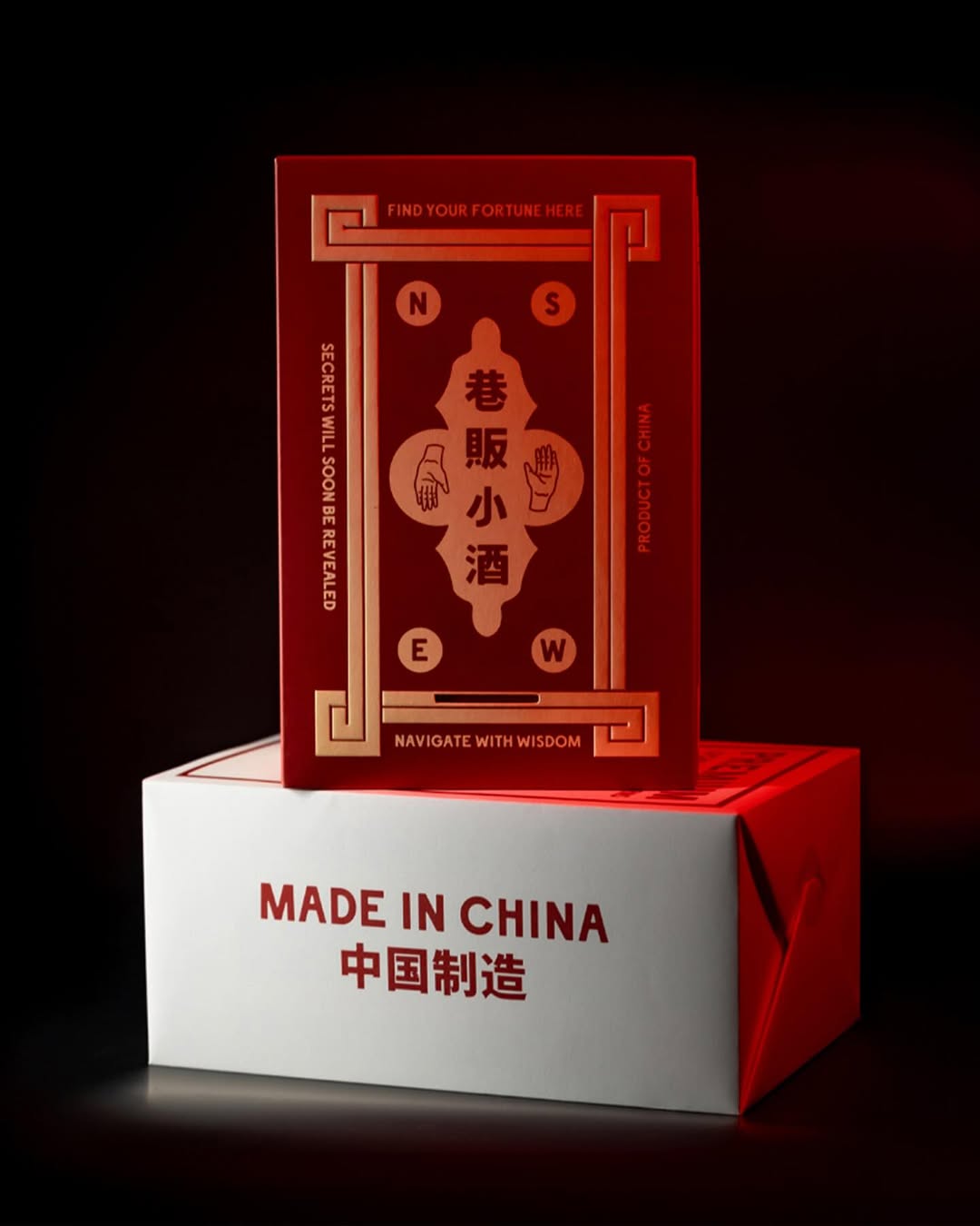
Peddlers Gin and its special edition packaging by OMSE and Think Packaging turns mystery into a design language.
The red-and-gold palette draws inspiration from traditional Chinese motifs, but the layout feels more like a coded message. Sharp geometric borders and compass symbols work together like a game, while the typography walks the line between instructional and ornamental, guiding your eye like a ritual. The result is liquor packaging that resembles an artifact you’d find behind a hidden door.
James Kape, Founder of OMSE, shares more below about the thought process that went into the design.